2012 LSSM Annual Report

This was something the director of communications made before leaving for a new position. I was asked to help out and fix a few things before it would be approved for print. The two pie charts with the color legends underneath them were requested to be larger and a misspelling in the article needed to be updated.

The top is the before/original and the bottom is the printed version featuring my updates.

updated 2012 annual report

Monte Nagler event

While at HAVEN, one of our third-party events was an art show with photographer Monte Nagler. For the invitation I got to use one of his photos and I had the opportunity to play with the editing and coloring to make it look spectacular. This best resembles the image he uses in his shows. The photo I was given was an original, untouched version.

Monte Nagler

I don’t know where this bridge is, but I want to go there!

Baby annoucement

My friends welcomed a baby earlier last month and asked me to make their announcements because they couldn’t find something they both really liked. I put this together using their suggestions and an idea I had in my mind. Obviously their kid is adorable and the main focus of the announcement, but the details and info are presented in a way that they’re really happy with. I’ve blurred the middle and last names for obvious reasons.

baby annoucement

New resume

SusanAumiller CV

This, friends, is my new resume. I’ve been working with a wordy kind of graphic one for a while, so I decided to take the plunge and create this bad boy. I’m really happy with it. Hopefully places I apply to will as well!

2011 Annual Report

At the end of 2011 I made the 2011 Annual Report for HAVEN, something that’s created and mailed each year and used throughout the year. Because it’s such a valuable communications tool I wanted to make sure I kept it cost-effective and utilized all the space at my disposal.

First I analyzed what didn’t work about the 2010 version. There was too much wasted space. Half the pages were used to show donor names! And even those weren’t using the entire page. I got to work and ended up with a layout that worked exceptionally well, and didn’t cost us any more than what was budgeted for, but it allowed me more space for client stories and even opened up two additional pages for the new capital campaign. Below are side-by-side comparisons of the 2010 and 2011 reports, or you can click here to view the 2011 report (PDF).

Everything in the 2011 version was written, edited, designed, chosen and laid out by me. I was so excited when it was approved, went to print and came back into office. Other employees also really liked the layout and the variety (and length!) of the client stories.

covers
2
3
4
5
6
7
8
9
10
11
12

Save the date


My cousin is getting married this July, and I get to make all her printed materials. Eek!

Her colors are pink, orange and green. She wants something kind of fun and colorful, with birds. Using Illustrator, I whipped this save the date together, which they’re both super excited about. The same graphic will be used on their other materials, and I bought some brightly colored envelopes from Paper Source to match the birds.

save the date

Custom wedding map

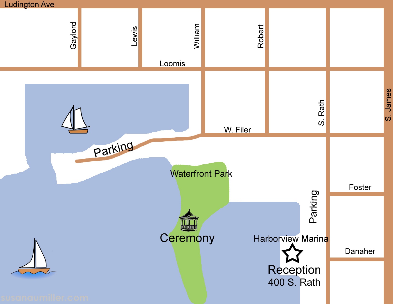
Just over a year ago, my then-coworker was on the verge of getting married and asked me to help her get a better looking map to match her beautiful wedding invitation. I gladly created a map for her, redrawing the area in Ludington, Mich. where her location was.

This is the final product:

Map for Carrie and Knoll copy

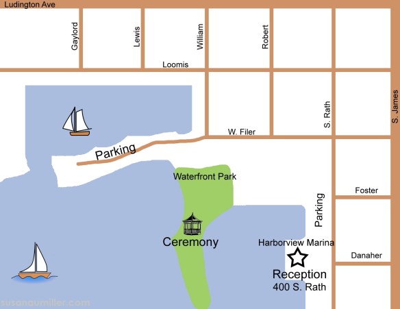
Much nicer than the screenshot she had gotten off Google Maps and had been planning to use previously, if I do say so myself. I was able to make the water and park areas match her wedding colors, which made her very happy.

This also leads me to the happy news that I’m (slowly) reopening my etsy shop, to hopefully earn some extra income. I’ve been commissioned to work on a few invitations, a website, save-the-date and an announcement within the past week, so I decided it was high time I reopened my shop. Please send me an email (susanmaumiller [at] gmail [dot] com) if you’re interested in a similar map for your wedding needs!

Designs for a friend

I have friends expecting their first child in the next few months. When trying to decide what to give them for their shower gift, I knew I wanted to make them something for the nursery. I had made them something for their wedding that they liked, so I figured I could easily make something for their nursery that they’d also like. And if not, they could at least use the frames for something else.

This is the first image I made (don’t worry, they’ve already seen it and I changed the name here so no one else will guess who it’s for):

rooney

The second one I made I ended up not liking as much for them, but still wanted to share it. They’re getting something else instead, but haven’t seen that one yet, so I can’t ruin the surprise until after the shower (they follow this blog!):

partyatmycrib

I had so much fun making these, and I’m sure my friends will really like them (and the secret one!).

Style Guide

communications guide

When I started working for HAVEN, they had a variety of printed materials they were using throughout the organization, but many of them didn’t match. They were made by different people in the different programs, without the use of a style guide.

My position hadn’t existed prior to my hiring, so the focus of others in the department had been more on fundraising than making sure the printed pieces matched (such is the norm in nonprofits). Within my first week I realized that HAVEN needed a style guide that outlined what should and shouldn’t be utilized in print and online design. I found a very outdated version from 2009 and used that as my jumping off point. I come up with a color palette, created templates for handouts, and crafted boilerplate statements.

Click here for the PDF of the style guide (it’s 14 pages and may take a few seconds to load).